Wallet Pass
The Wallet Pass is the loyalty card a member installs on their phone — Apple Wallet on iPhone, Google Wallet on Android. It's where members find their member QR for the cashier to scan, see their balance and gifts at a glance, and (on iPhone) get push notifications when they walk near a branch.
This page is the map for the Wallet Pass settings area. Five tabs — Settings, Design, Fields, Locations, Passes — cover everything from how the pass is signed to what the cashier sees on the front and what the member sees pinned to their lock screen.
The pass is already wired up the day your club goes live. Day-to-day, you'll spend almost all your time on Design (colors, images, punch-card visuals) and Fields (what shows on the front and the back of the card). Locations is for proximity push notifications. Passes is a read-only audit table.
Screenshots on this page show one merchant's setup (Spanish labels). Your Hub displays the labels and content you configure for your own program.
Who can change what
The five tabs aren't equal. Some are pre-configured at club setup and shouldn't change after that; others are meant to be edited as the program evolves.
- Settings — pre-configured at club setup. Don't change anything here unless you've been asked to. The Pass Type Identifier, signer URLs, and Google Pay class IDs all have to match the certificates and accounts the pass is signed against; editing them silently breaks every pass already in the wild.
- Design, Fields, Locations — open for the merchant (or whoever runs the program on their behalf) to edit at will. Changes propagate to existing passes the next time each device refreshes the pass.
- Passes — read-only audit table of every pass that has ever been downloaded. The Update all passes button on this tab is for support; ignore it unless asked.
Settings tab — leave it alone
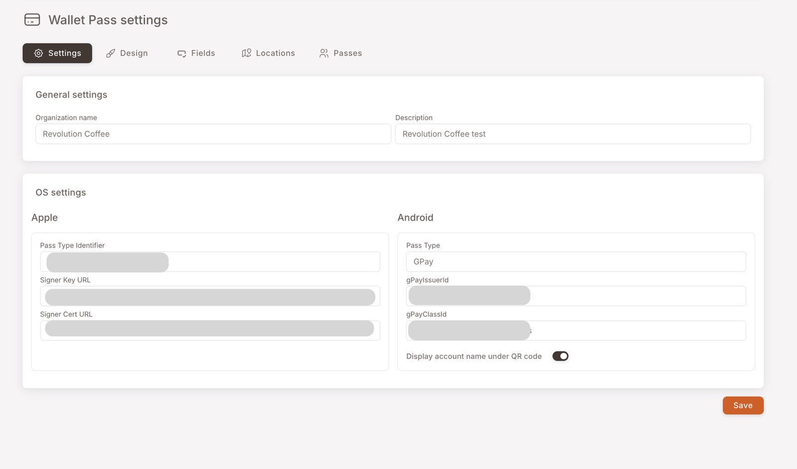
This tab is where the pass is technically registered — the identifiers and signing URLs that prove to Apple and Google that the pass came from a trusted issuer. It's set up once when your club goes live and shouldn't be touched afterwards.
Editing anything on Settings after launch will invalidate every Wallet Pass already installed on members' phones. There is no recovery short of re-issuing every pass. If you think something here needs to change, talk to support first.
Design tab — colors, images, conditional looks
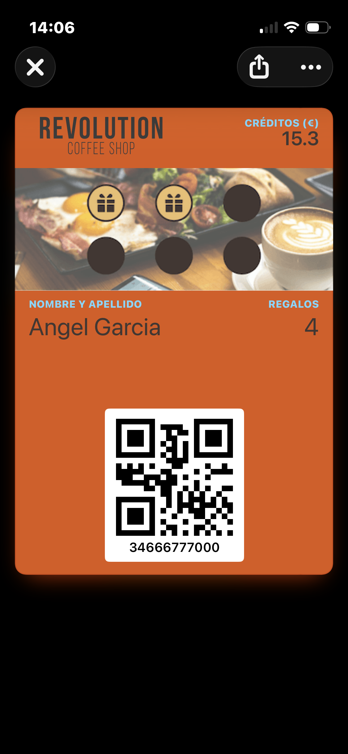
This is where the look of the card lives. Here's what a finished pass looks like on the device — what your members see when they open it at the till:
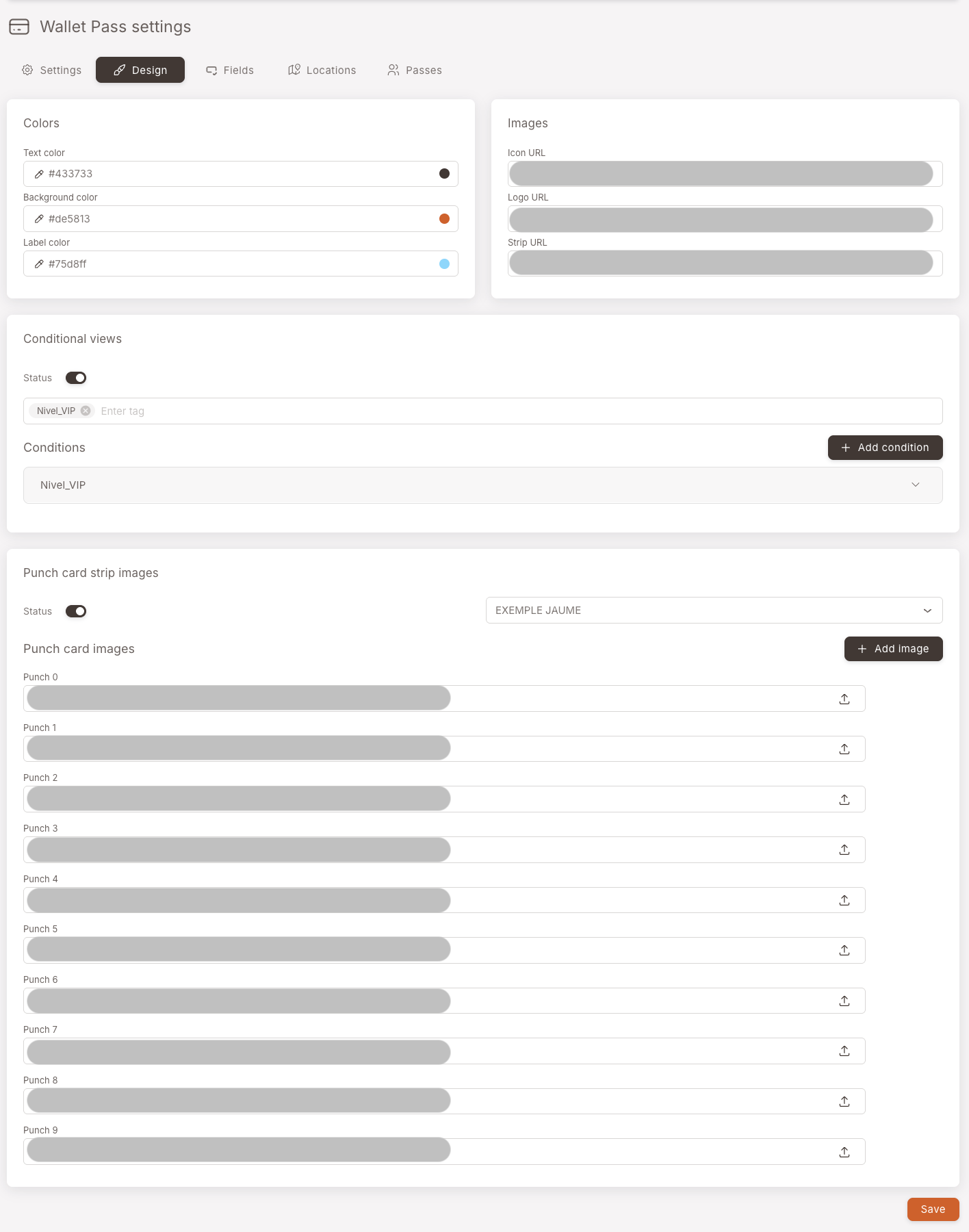
Four panels on the tab, each covered below.
Colors
Three colors define the whole card: text, background, and label. Pick them in the panel and the live pass on every member's phone updates the next time it refreshes.
The pass above uses an orange background with a darker brown text color and a small accent on the label. Anything you set here applies to the default view of the pass — conditional views, if you set any up, override these.
Images
Three images make up the visual identity of the card. Upload a new file in the corresponding slot to replace any of them.
- Icon — the small square that shows up in lock-screen notifications and the Wallet list view. 500 × 500 px PNG or JPG.
- Logo — the wordmark in the top-left corner of the open pass. 480 × 150 px PNG.
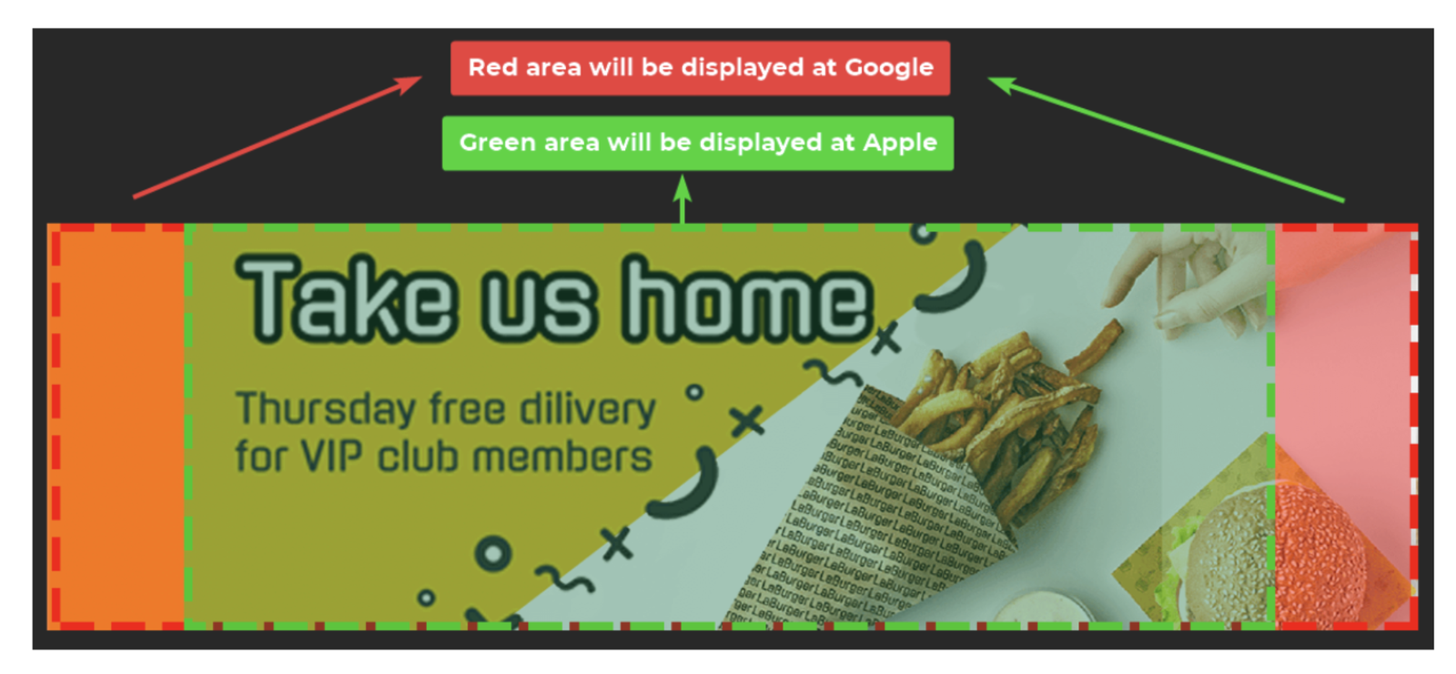
- Strip — the wide banner image that runs across the top of the open pass under the logo. 1125 × 336 px for both Apple and Google.
The pass is re-downloaded over the air every time a member's device refreshes it. Aim for under ~500 KB per image — compress PNGs with TinyPNG (or similar), or save JPGs at ~80 % quality. Heavy images mean slow updates and complaints that "my pass isn't refreshing."
The Strip image is 1125 × 336 px, but the safe area is the centre 900 × 336 px. Apple Wallet displays only the safe area; the side margins may be cropped depending on the device. Google Wallet displays the full 1125 px width.
When you design a strip image, keep anything readable — text, logos, the focal point — inside the central 900 × 336 px. Use the outer margins for backgrounds, gradients, or decorative bleed only.
Conditional views
Make the pass look different for members who carry a specific tag. Optional — most clubs run a single design and skip this entirely.
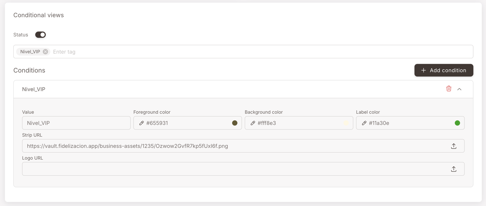
How conditional views work — open if you want a different look for VIPs, a launch cohort, etc.
Pick a tag (e.g. Nivel_VIP).
Override the colors (foreground / background / label).
Optionally override the Strip and Logo URLs.
Members with that tag see the override; everyone else sees the default.
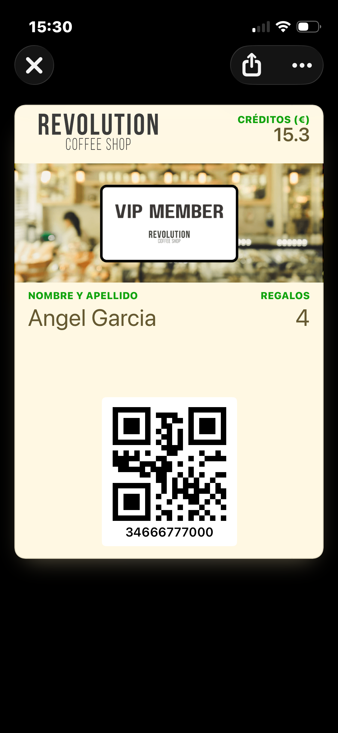
A conditional view is an alternate look for the pass that swaps in when a member carries a specific tag. The screenshot below is the same pass for a member tagged Nivel_VIP — cream background, dark-brown text, green label colors, and a VIP MEMBER strip image swapped in over the default banner. Same QR and same data underneath, just a different look.
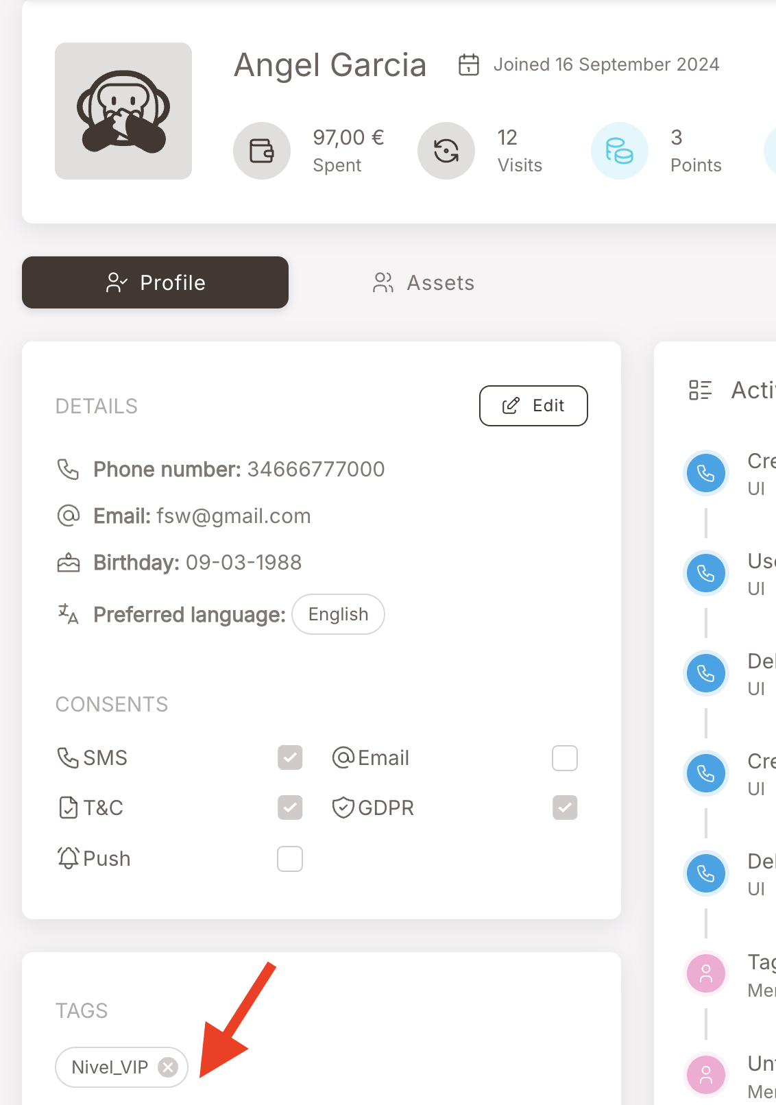
The matching tag is attached the same way every other tag is — manually from the member's profile, automatically by a Rule, on import, etc.:
You can stack several conditional views (one per tag value); the matching tag wins. Members with no matching tag get the default design.
Punch card strip images
If your loyalty program runs a punch card and you want the punch progress to show on the pass itself, this is where you wire it up. Optional — leave it alone if your punch cards are behind-the-scenes only.
How punch-card strip images work — open if you want punch progress visible on the pass
Pick the punch card from the picker.
Upload one strip image per punch state — Punch 0, Punch 1, Punch 2, …
The pass swaps the strip automatically as the member earns punches.
You upload one strip image per punch state — Punch 0, Punch 1, Punch 2, and so on, up to the maximum number of punches in the card. The pass swaps the strip image automatically as the member earns punches. In the pass shown above, the breakfast photo is the punch-2 strip — two cups filled in (the gift icons), three more to go (the empty circles).
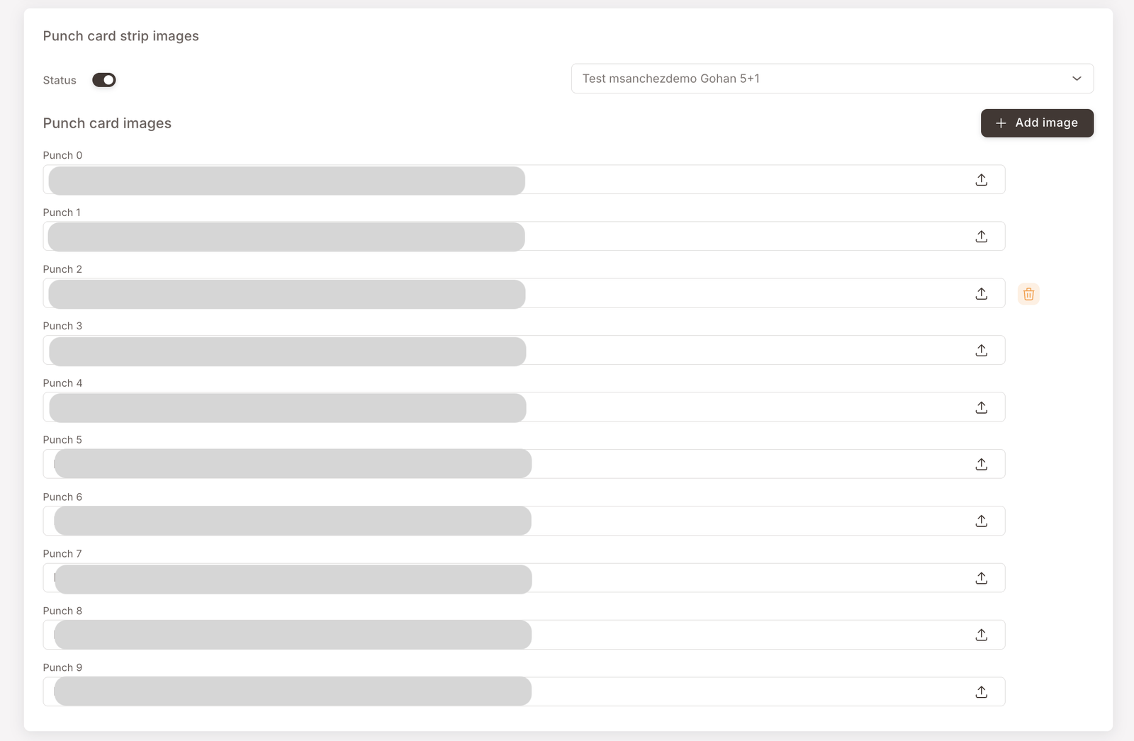
If your program runs more than one punch card, only one of them can render on the Wallet Pass at a time. The picker at the top of the panel is where you choose which punch card the strip image set belongs to — pick the one you want featured on the pass.
Fields tab — what shows on the front and back
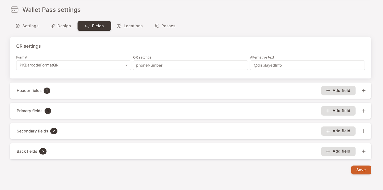
Fields is where you decide what information the pass shows around the QR — both on the front (what the cashier sees when the member opens the pass at checkout) and on the back (what the member sees if they tap the (...) to flip the pass over).
Five field zones; you don't usually need to touch all of them.
QR settings
The header at the top of the tab controls the QR itself. The piece worth knowing about is Alternative text — the text rendered under the QR. By default it shows the member's phone number, controlled by the placeholder @displayedInfo. Erase that placeholder and the line under the QR disappears entirely.
Front-of-card fields
The three labelled zones around the QR on the front of the pass — Header, Primary, Secondary. Wired up at club launch; usually all you'll change later is the Label (the human-readable caption).
The three front-of-card field zones — open to see what each one is for
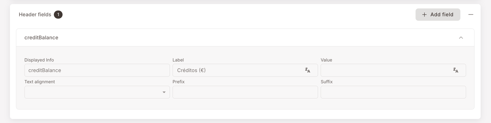
Header — top-right headline number (e.g. Créditos (€) — 15.3).
Primary — large title under the strip image. Often left empty.
Secondary — the row right above the QR (e.g. Nombre y Apellido / Regalos).
What you'll typically change post-launch: the Label of an existing field.
The pass front is divided into three labelled zones the screenshots show in collapsed form on the Fields tab:
- Header fields — the small zone at the top-right, used for the headline number you want the cashier to see at a glance. The pass above uses it for Créditos (€) — 15.3.
- Primary fields — large title text under the strip image. Often left empty for image-led designs.
- Secondary fields — the row above the QR. The pass above uses it for Nombre y Apellido — Angel Garcia on the left and Regalos — 4 on the right.
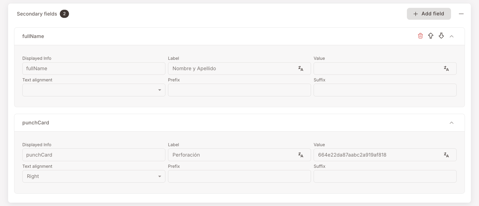
You won't usually rebuild these from scratch. The fields are wired up at club launch to point at the right member attributes; what you'll typically change after launch is the Label (the human-readable caption above each value) when you decide Créditos should now read Saldo, or Regalos should read Premios.
Back-of-card fields
What members see when they tap the (...) to flip the pass over — usually basic profile info plus tappable branch locations linked to Google Maps.
How back fields work + the branch-location link pattern
Back fields = the things a member looks up, not the things the cashier needs.
Branch locations: paste an <a href="https://maps.app.goo.gl/...">📍 Branch name</a> into the Apple – Attribute value field, and the equivalent Google – URL / Description for Android.
One back field per branch you want listed.
The Back fields panel is the long list — fourteen entries in this example. The back of the pass is where you put the things a member might want to look up but don't need to see at every checkout: full name, email, phone, and so on.
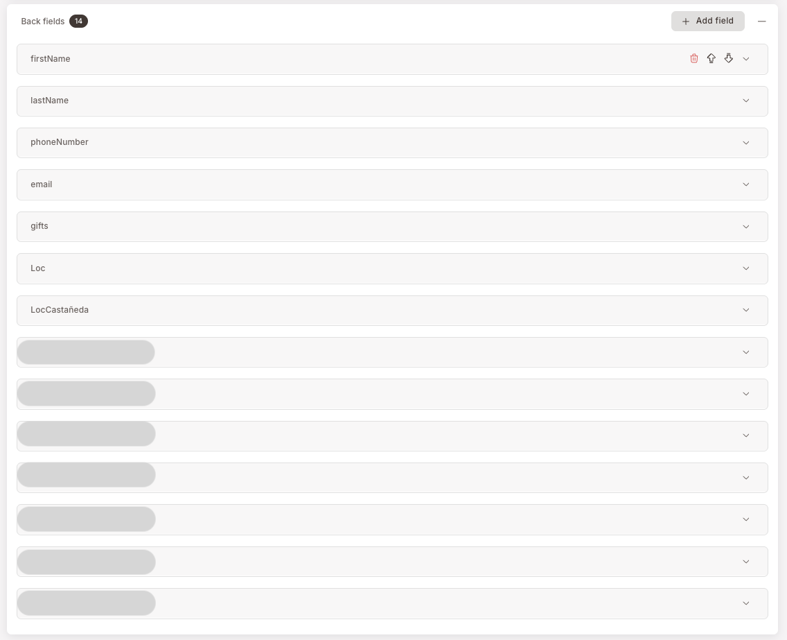
The interesting thing back fields can do, beyond just reading data, is render clickable links — most often a branch location with a Google Maps link so a member can tap a branch name on the back of the pass and have navigation open up. The LocCastañeda row in the screenshot above is one of those: the Apple — Attribute value field holds an <a href="..."> HTML snippet, and the parallel Google — URL / Description fields hold the equivalent for Android.
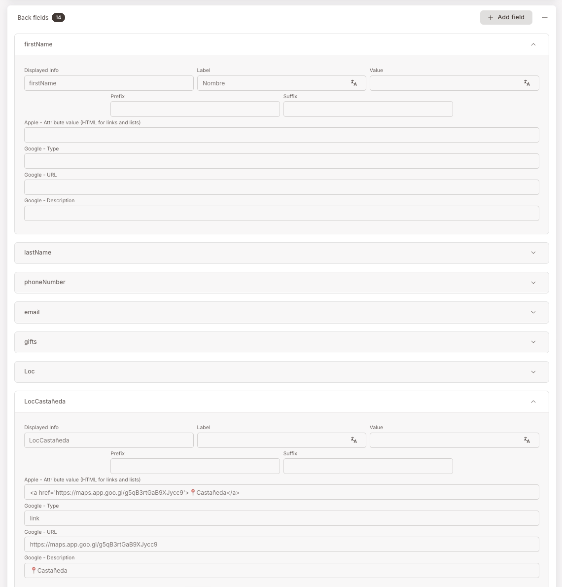
Add one of these per branch you want listed; members get a tappable list of all your locations on the back of their card.
Locations tab — proximity push notifications (iPhone)
iPhone-only feature — sends a lock-screen push when a member with the pass installed walks near a defined coordinate. Optional. Skip the rest of this section if proximity notifications aren't part of your plan.
How proximity notifications work — open if you want lock-screen pushes near branches
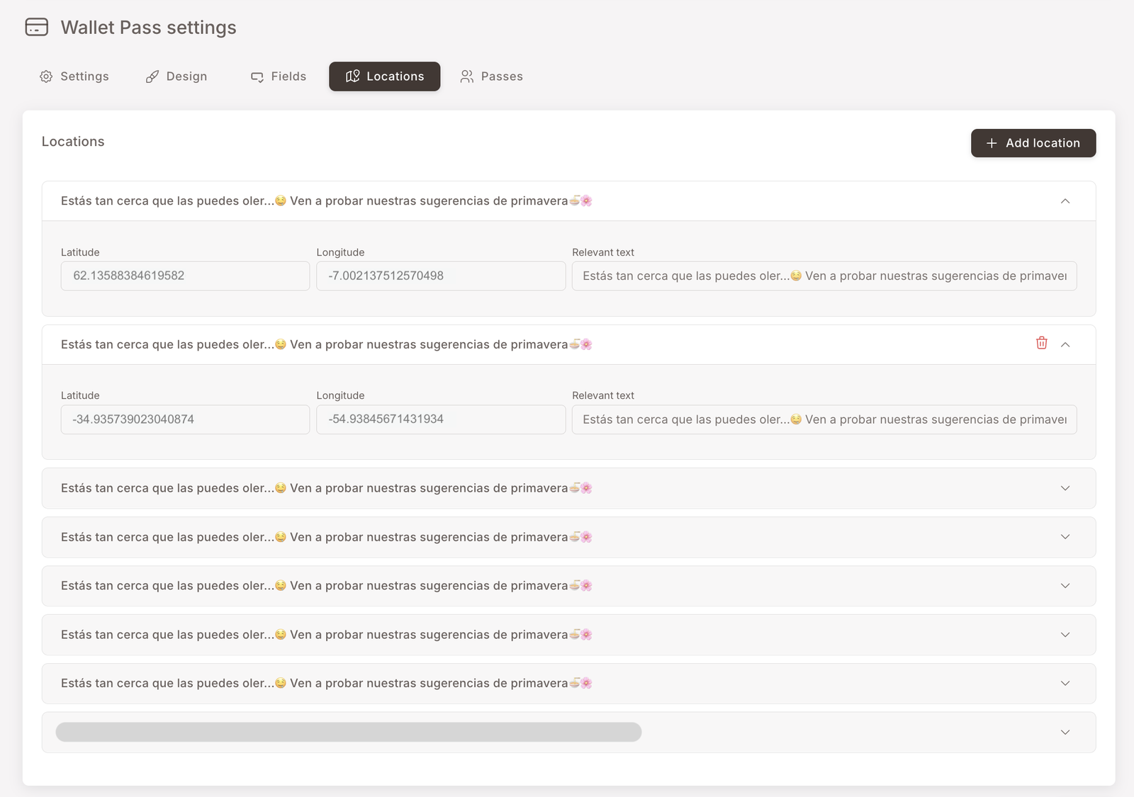
Add a location: Latitude / Longitude / Relevant text.
Up to 10 locations per pass (Apple's limit).
Grab coordinates from Google Maps — right-click the spot, copy the lat/long pair.
Each location has its own push message.
Apple Wallet handles the geofencing; you just supply the coordinates and the message. The configuration:
- Latitude / Longitude — the coordinates of the spot you want to fire near. Easy way to grab them: open Google Maps in a browser, right-click the spot, and copy the coordinates pair from the menu that appears.
- Relevant text — the message that pops on the lock screen when the device gets near. Each location has its own message, so you can tailor the copy per branch ("Welcome back to our Castañeda location") or per use case ("You're near our flagship — try the new spring menu").
Apple's only hard limit is ten geofenced locations per pass. There's no documented length cap on Relevant text — in practice it behaves like any other push notification, with the device truncating it based on the user's font size and notification settings.
This is iPhone-only — Google Wallet doesn't support proximity-triggered notifications the same way. Android members carry the same pass; they just won't see lock-screen pushes when they walk past.
If you have more than ten branches — pick the ten that matter most. Common heuristics: the highest-traffic branches, the newly-opened ones you want to drive awareness to, or the ones in city centres where members are likely to be passing by anyway. The other branches still appear on the back of the card (see Back fields above) — they just won't ping the phone on approach.
Passes tab — read-only audit
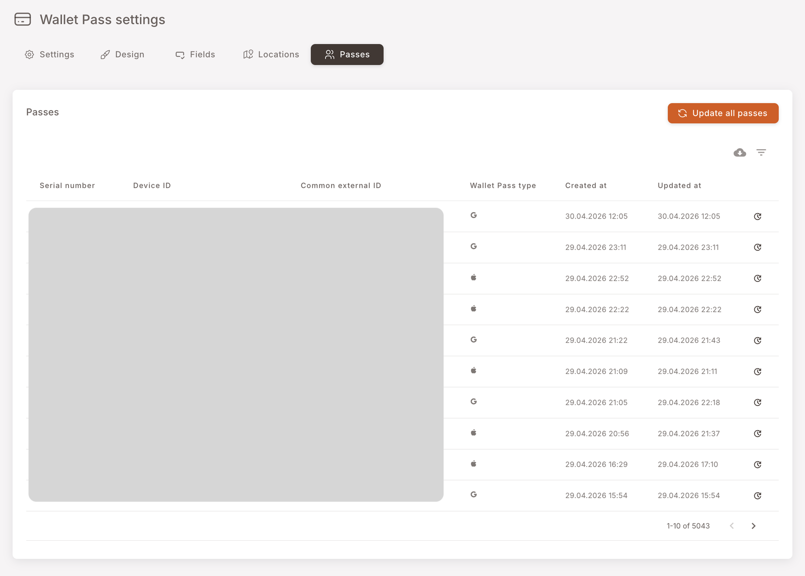
The Passes tab is the audit trail of every Wallet Pass that has ever been downloaded — one row per device-pass pair. Useful when:
- You need to confirm that a specific member has actually installed the pass (search by their identifier).
- You're investigating a "my pass isn't updating" complaint and want to see when the pass was last touched on the device.
- You're sizing the install base before a campaign — the counter at the bottom-right tells you the total.
Two utilities sit in the top-right:
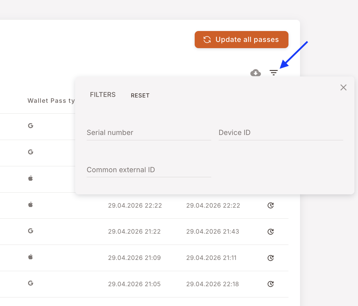
- Filters — narrow the list by Serial number, Device ID, or Common external ID. Useful for finding one member's pass or one device.
- Download CSV — exports the current (filtered) view to a spreadsheet.
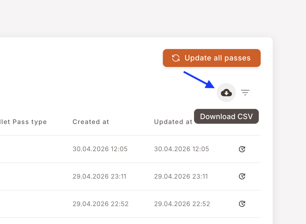
Don't press Update all passes. The big orange button at the top of the tab forces a refresh on every pass in the install base — thousands of devices simultaneously. It triggers a notification storm, hits the Apple and Google APIs hard, and in extreme cases can rate-limit the issuer for a window. Use this only when support has asked you to, and only with us watching.
What the icons in the Wallet Pass type column mean
Each row shows a tiny G or an Apple glyph in the Wallet Pass type column. G is a pass installed via Google Wallet; the Apple glyph is one installed via Apple Wallet. The pass content is the same — the column just tells you which OS the device is running.