Dashboard
The Dashboard is the management panel's landing page — a one-screen overview of program health: total members, penetration and retention trends, sales and visits with member-vs-non-member splits, top spenders / top visitors / top locations, and a yearly bar chart you can flip between Sales / Visits / Average Spend. Most cards compare a "current" window to a "previous" window of the same length; the time-period picker at the top sets that window.
The Dashboard is what loads when you sign in to the management panel. It's a view-only surface — nothing here is configured or edited; you read it. Use it as the daily morning check ("how are we doing?"), the weekly review, and the demo screen ("here's what the program looks like").
This page is the map for the Dashboard. Configuration surfaces — Smart Campaigns, Members, Comm. Templates, Benefits — live elsewhere in the help center.
What you'll find at a glance
The screen has four zones, top to bottom: headline KPIs, the time-period filter, sales-and-visits cards with leaderboards alongside, and the Members vs Non-members yearly chart at the bottom.
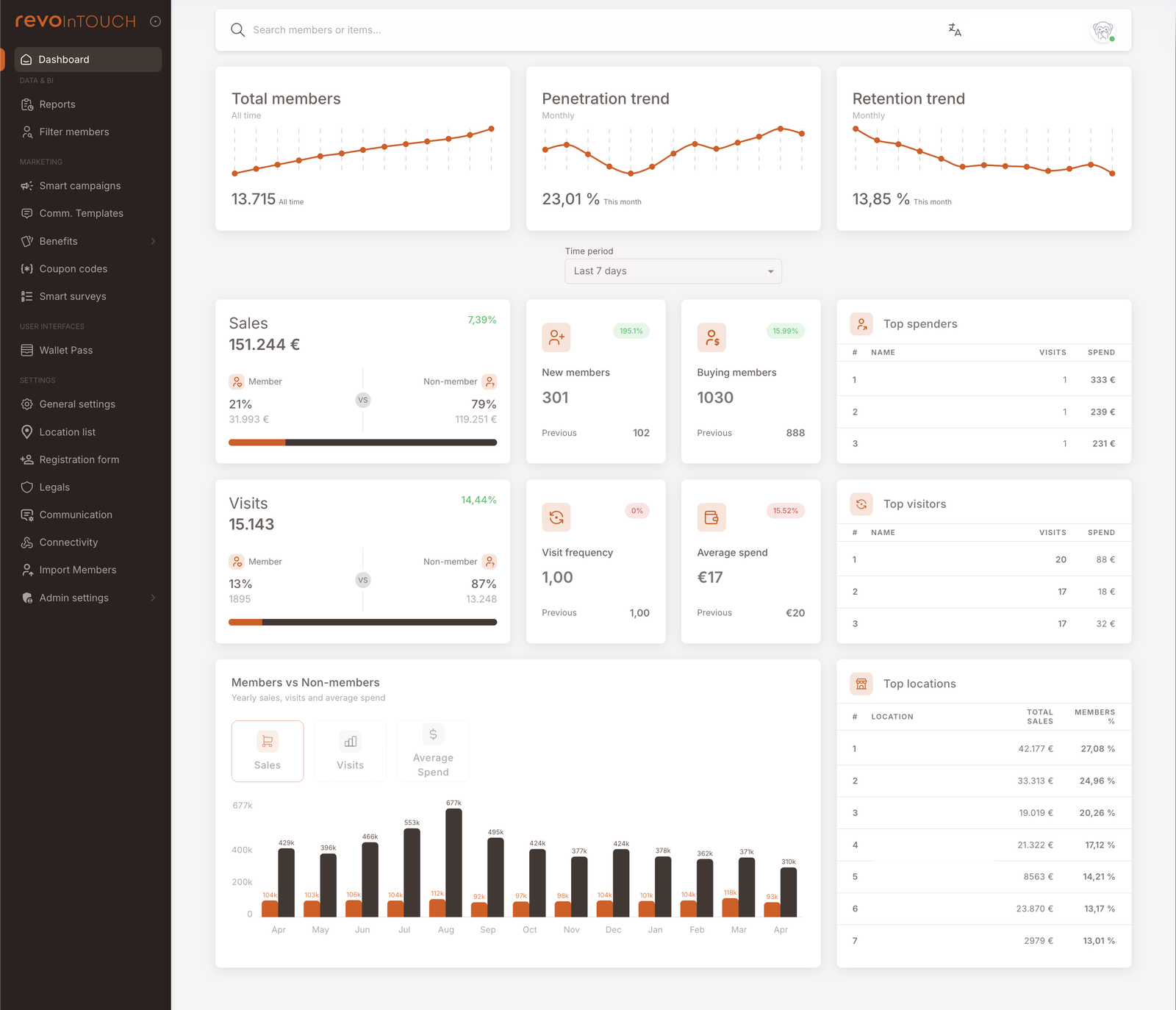
Top KPIs — three trend lines
Three cards across the top, each a small trend chart with a headline number:
- Total members — the all-time count of registered members. Trend line shows how the membership base has grown over time. (The screenshot shows 13.715 — All time.)
- Penetration trend — member sales ÷ total sales. The share of revenue that flows through identified members. Rising penetration means the loyalty program is capturing more of the business. Chart is monthly. (Screenshot: 23.01% — This month.)
- Retention trend — # of buying members ÷ # of total members. The share of registered members who actually transacted in the period. Rising retention means the membership base is active, not dormant. Chart is monthly. (Screenshot: 13.85% — This month.)
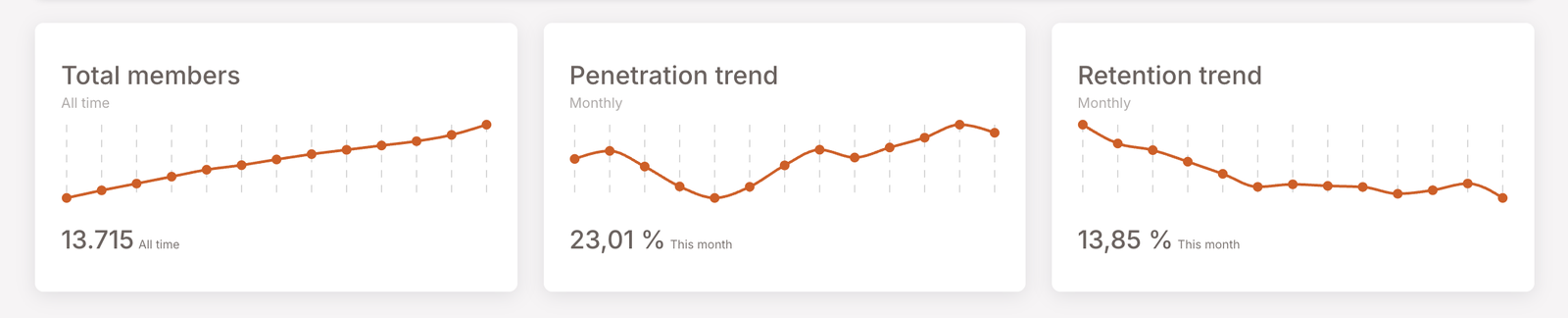
Time period selector
A single dropdown beneath the top KPIs. Options:
- Last 7 days (default)
- Last 14 days
- Last 30 days
- Last 90 days
- Last 6 months
The selector controls the "current vs previous" comparison on the sales / visits / new members / buying members / visit frequency / average spend cards, and the Top spenders / Top visitors / Top locations leaderboards as well. The top KPI trend lines (Total members / Penetration / Retention) and the bottom yearly chart are not affected by this picker — they have their own fixed cadence.
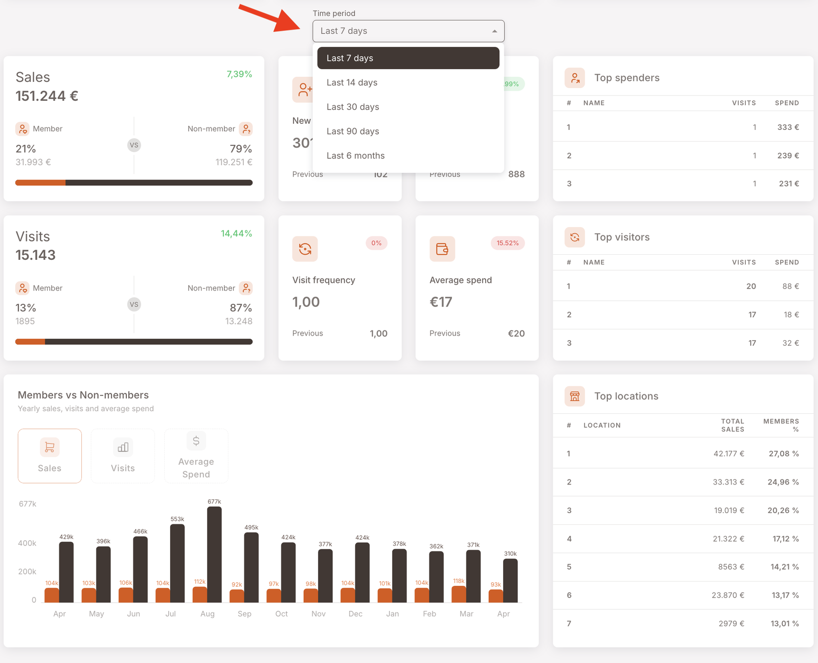
Sales and Visits, with member-vs-non-member splits
Two big cards anchor the middle of the screen. Each shows the headline metric for the selected period plus the share split between identified members and unidentified non-members — so you can see at a glance how much of the business is going through the loyalty program vs walking past it.
- Sales card — total revenue in the period. The progress bar shows the member / non-member share by amount. Percentage in the corner is the change vs the previous window.
- Visits card — total transactions in the period. Same member / non-member split, same change-vs-previous in the corner.
Surrounding each big card are two smaller satellite cards:
- New members — count of members whose registration date falls in the period. (Screenshot: 301, +195.1% vs previous 102.)
- Buying members — count of registered members who made at least one purchase in the period. The two overlap: a new member who registers and then transacts in the same period is counted in both — once as a new member, once as a buying member.
- Visit frequency — average visits per member in the period. (Screenshot: 1.00, 0% vs previous 1.00.)
- Average spend — average basket value per identified-member visit. Member-only — non-member checks aren't included in the satellite card (they are visible separately on the bottom yearly chart's Average Spend tab). (Screenshot: €17, −15.52% vs previous €20.)
Each comparison percentage is colour-coded — green for an increase, red for a decrease — relative to the previous window of the same length. A green +7.39% on Sales means the current period beat the prior one; a red −15.52% on Average spend means it fell.
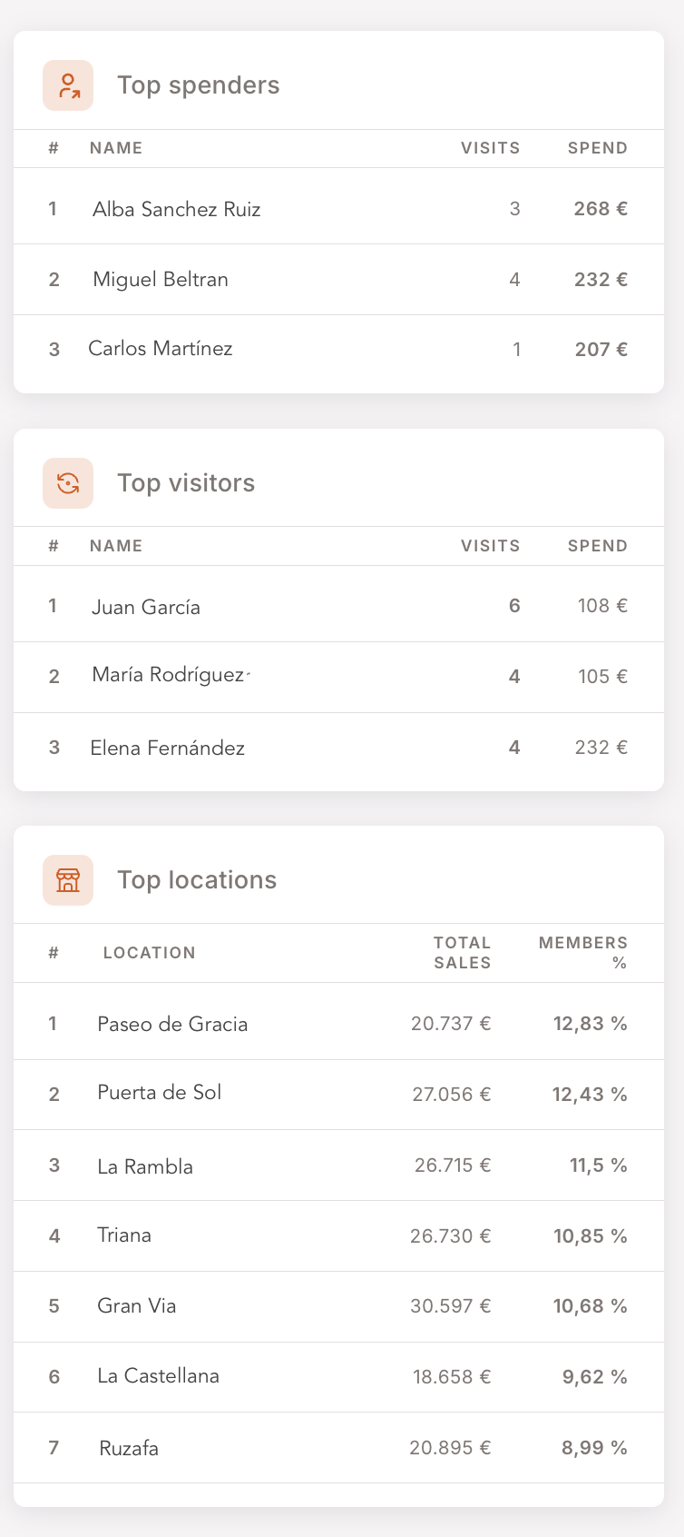
Top lists
Three leaderboard tables run down the right side and across the bottom row:
- Top spenders — members ranked by spend in the period. Columns: rank, name, visits, spend.
- Top visitors — members ranked by visit count in the period.
- Top locations — branches ranked by total sales (with member share %).
These are the surface you'd use to identify who to reach out to — VIPs to thank, lapsed top spenders to re-engage, top branches to recognise.
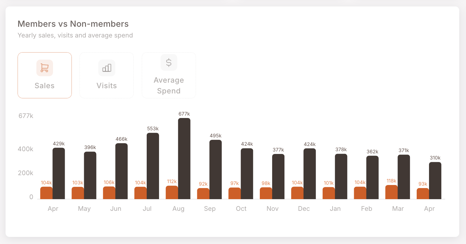
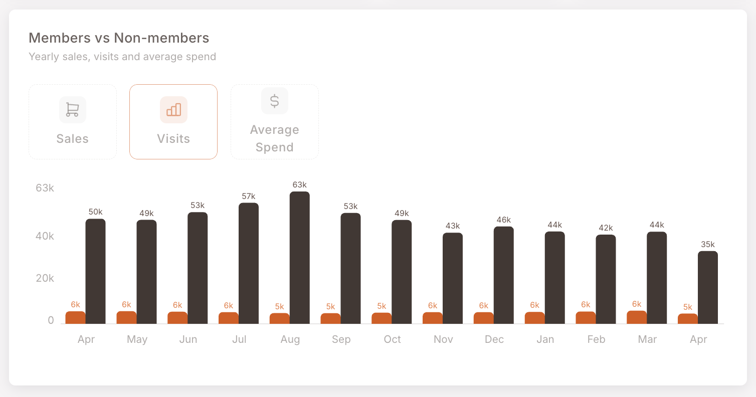
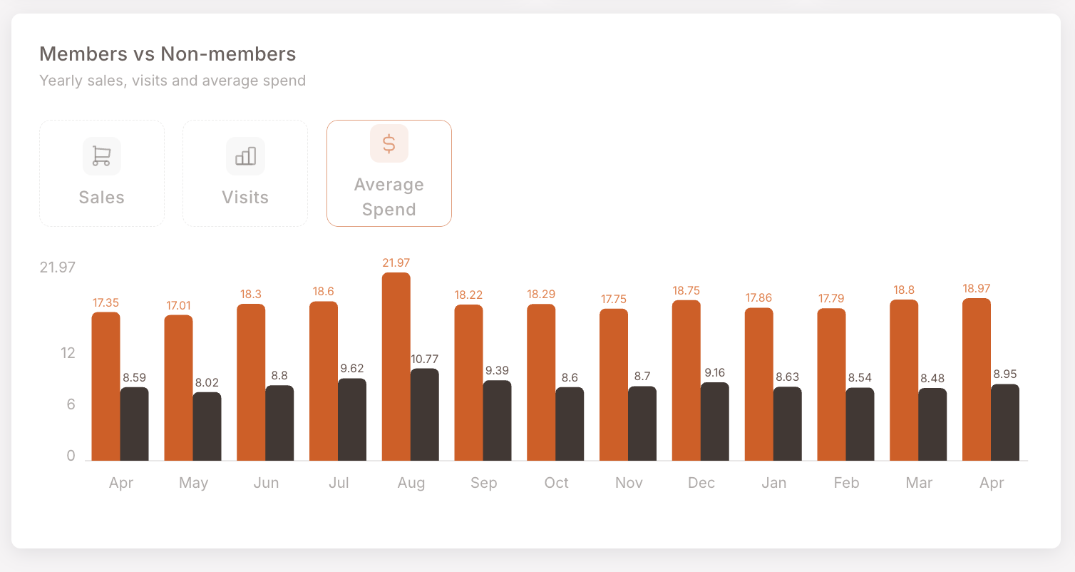
Members vs Non-members yearly chart
Wide bar chart at the bottom — three view modes (Sales / Visits / Average Spend), trailing 13 months, independent of the time-period picker
A wide bar chart spans the bottom of the screen. Independent of the time-period filter — this one is fixed to the trailing 13 months (Apr to Apr in the screenshot), regardless of what the picker at the top is set to. Three view modes via the toggle on the left:
Sales — bars per month showing total sales, member (orange) vs non-member (dark). The typical pattern: non-member sales dwarf member sales by absolute amount, but the member contribution is steady.
Visits — same layout, visit counts instead of revenue. Member visits run roughly 5k–6k per month; non-member visits run 35k–63k.
Average Spend — here the picture flips. Members spend more per visit than non-members (e.g. €17–22 vs €8–10 in the screenshot). This is the chart that often anchors the "loyalty program ROI" conversation.
How members and non-members are tracked
The Dashboard's most useful contrast — the member-vs-non-member split visible across Sales, Visits, and the yearly chart — depends entirely on whether the cashier identified the member at checkout. A purchase where the member's loyalty card / phone number / QR was attached at check-close counts on the member side; an anonymous check counts on the non-member side, even if the same person was buying.
This means:
- The non-member share isn't necessarily "people who aren't in the program" — it can include members who just weren't identified that day. Cashier behaviour and identification flow design have a big effect on this number.
- The "Member %" share on Sales / Visits is partly a measurement of program activation at the till, not just program membership.
- A program with rising membership but flat member-side sales% is usually a sign that identification at checkout is the bottleneck, not acquisition.
This is the same identification model the Smart Campaigns and Members sections document — only identified-member checks fire member-aware Rules, only identified-member checks count in member spend, only identified-member checks earn member rewards.
When to use the Dashboard
3 common usage patterns — daily check, weekly review, demo
Daily morning check. Glance at the top KPIs and the change percentages on the Sales / Visits cards. If something jumped or cratered overnight, the Dashboard is where you spot it before it becomes a question.
Weekly review. Switch the time-period to Last 7 days, then walk through Sales / Visits / Top spenders / Top locations. The deltas vs previous week answer most "is the program healthy?" questions in under 5 minutes.
Demo / partner walkthrough. The Dashboard is the most visually compelling page in the management panel. For a prospect or a new partner, this is where you start — the trend lines tell the loyalty story without needing to explain the rule engine.
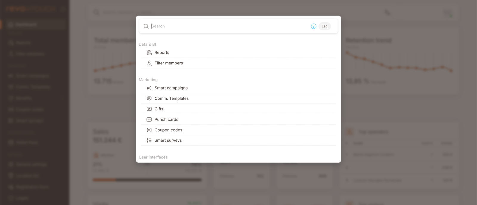
Quick navigation palette
The top-bar search field opens a palette for jumping anywhere in the management panel
The Search members or items… field at the top of every page also serves as a quick-navigation palette. Click into it and you'll see a list grouped by section — Data & BI (Reports, Filter members), Marketing (Smart campaigns, Comm. Templates, Gifts, Punch cards, Coupon codes, Smart surveys), User Interfaces — letting you jump to any surface without clicking through the left-nav hierarchy.
Gotchas
5 things to watch for when reading the Dashboard
- Member share depends on identification at the till. A low member share in Sales or Visits isn't automatically a membership problem — it can be a checkout-flow problem (cashiers not scanning the loyalty card, members not presenting it). Before reacting to a low share, check identification rates with your POS partner.
- The time-period picker doesn't move every chart. Top KPIs (Total members / Penetration / Retention) have their own monthly cadence and aren't affected. The bottom yearly chart is fixed to the trailing 13 months. Only the middle-band cards and the top-N tables respond to the picker.
- "Previous" comparisons are same-length-window, not same-day-last-year. Last 7 days compares this 7-day window to the prior 7-day window. Last 90 days compares to the prior 90-day window. There's no week-over-week vs year-over-year toggle on these cards.
- Data freshness is ~15 minutes. The Dashboard updates with a 15-minute delay relative to the POS. A sudden zero, dip, or spike in the very last quarter-hour of a shift may just mean the data hasn't landed yet — wait 15 minutes and re-check before reacting. If a number stays anomalous beyond that window, it's likely real (or a data-pipeline problem worth raising with your integrator).